Traveller Kids: Visual identity for a educational games start-up
IDENTITY DESIGN | PACKAGING | ILLUSTRATION | GAMES | TRAVEL
Visual Identity design for Traveller Kids: A brand for the love of travel, games & learning. Traveller Kids is a subscription-based educational games start-up in Delhi, India. The brand aimed at introducing children aged 7-10 years to the concept of travel and make them experience a new country every month, through a combination of reading material, games and physical activities.
CLIENT: Traveller Kids
YEAR: 2012
MY ROLE: Identity Design, Illustration, Packaging
TOOLS: Illustrator, Keynote
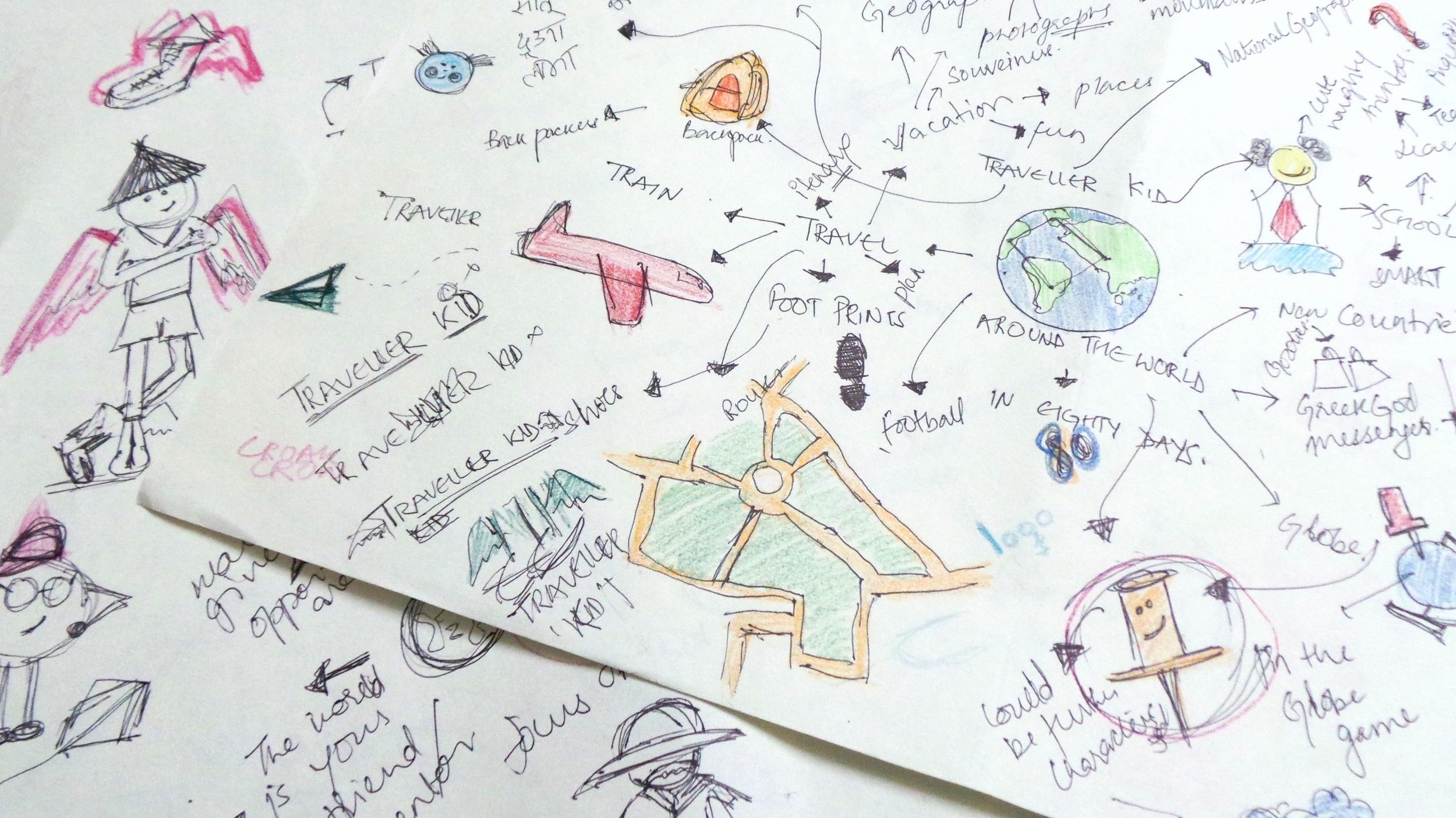
Concept
When I started brainstorming for the elements and directions that could visually represent the brand, the concept of flight/ wings/ planes, I remembered playing with paper planes as a kid and then teaching my niece how to make one. This led to initial idea for the visual identity for the brand and later helped in developing content for the initial line of products.
Logo Development
Paper planes in a way were a true representation of Traveller kids, a brand formed out of the love for travel, games and fun.
The visual identity incorporated both playfulness and professionalism. We decided to keep the upper trail free, doodling with it to communicate with our little consumers. This made the identity dynamic and evolving, just like the concept of travel itself.

Logo development
Trail modifications to balance the logo visually.
Paper planes are a kid's first mode of transportation. On its wings, a kid soars the skies of his imaginary world, travel sans borders and visit places his extraordinary mind can think of.
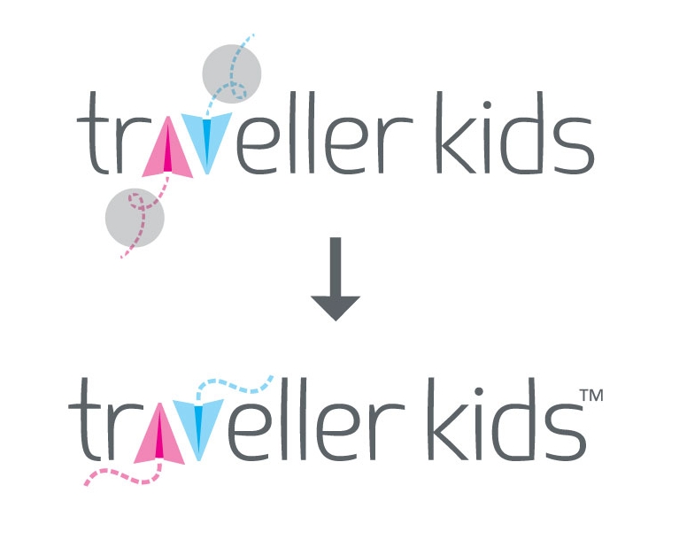
Final Logo
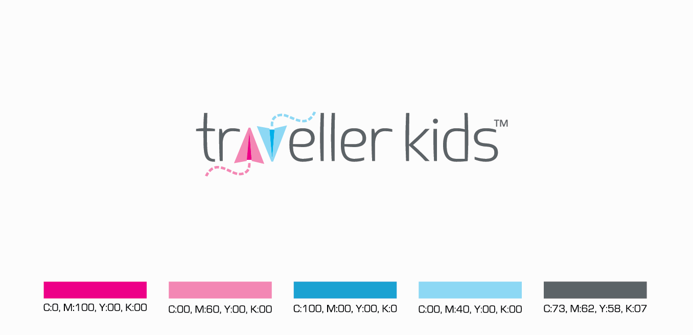

Logo: Adaptations
The upper trail in the logo is designed to be dynamic. It can be customized to suit various marketing and communication avenues. It adds to the playfulness of the brands and connotes movement/travel.


Logo: Applications
The entire product is centered around travel and since the owners are themselves young entrepreneurs, I decided to add a little playfulness to their business cards.
The card can be torn along the perforation to make tiny paper planes while the recipient retains the other half with the contact details.
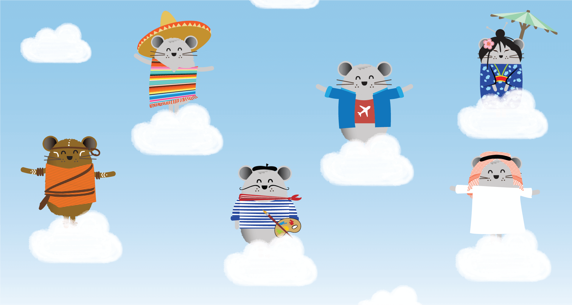
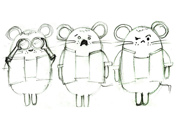
Mascot Development
Since the product is based on the theme of travel, we decided to take kids on the journey around the globe with a mascot Atlas, who is a super-mouse who travels the world with its luggage Miles


Subscription Box- Packaging and graphics


Acknowledgements: Photography- Traveller kids | Product Rendering- Mohit Arora | Product Development: Anuj Gadre, Jyoti Mann